
Zero-dependency charts for Python and AI agents. SVG and PNG, 15 chart types, a one-line MCP server, and a Claude skill.


Quickstart
uv add chartedOr with pip:
pip install chartedfrom charted import BarChart
chart = BarChart(
title="Sales by Quarter",
data=[120, 180, 210, 150],
labels=["Q1", "Q2", "Q3", "Q4"],
)
chart.save("chart.svg")
chart.save("chart.png") # PNG export (requires cairosvg)That is the whole loop: pass a list of numbers, get back an image. No numpy, no pandas, no config files.
Core principle: charted itself has zero runtime dependencies. PNG export and MCP server support are opt-in extras that pull in their own dependencies, and the base library stays pure Python.
Gallery
Every chart type, rendered. Each image below was generated by charted itself from the example script; the Quick Tour shows the code behind each one.
Bar 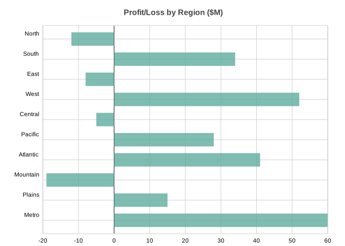 | Column 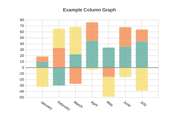 | Line 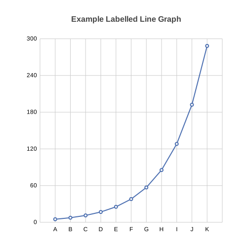 |
Scatter 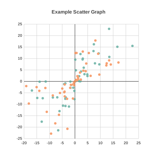 | Pie 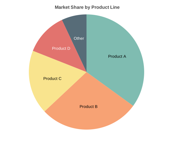 | Area 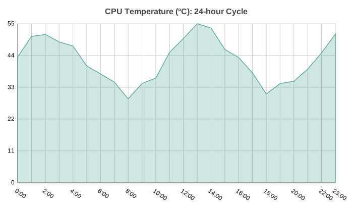 |
Radar 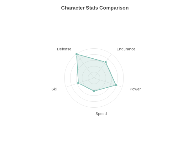 | Box Plot 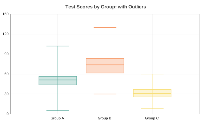 | Histogram 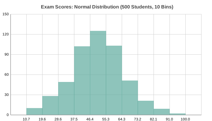 |
Heatmap 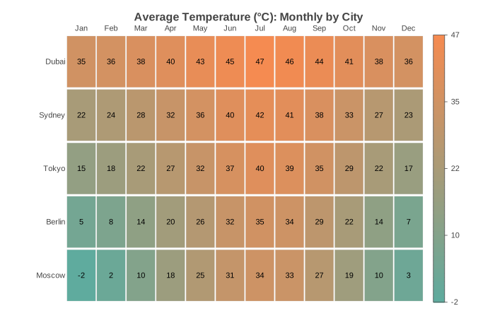 | Gantt 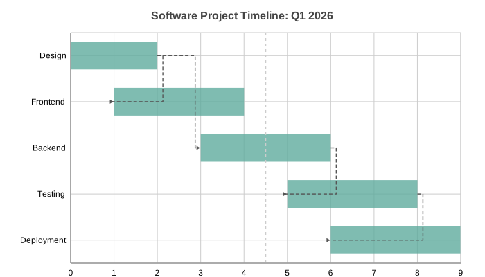 | Bubble 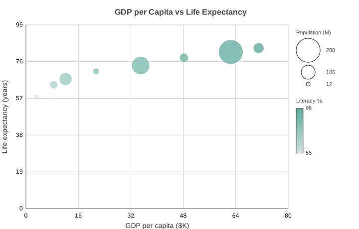 |
Combo 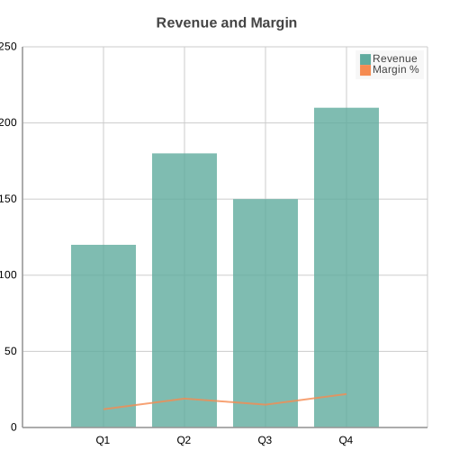 | Polar Area 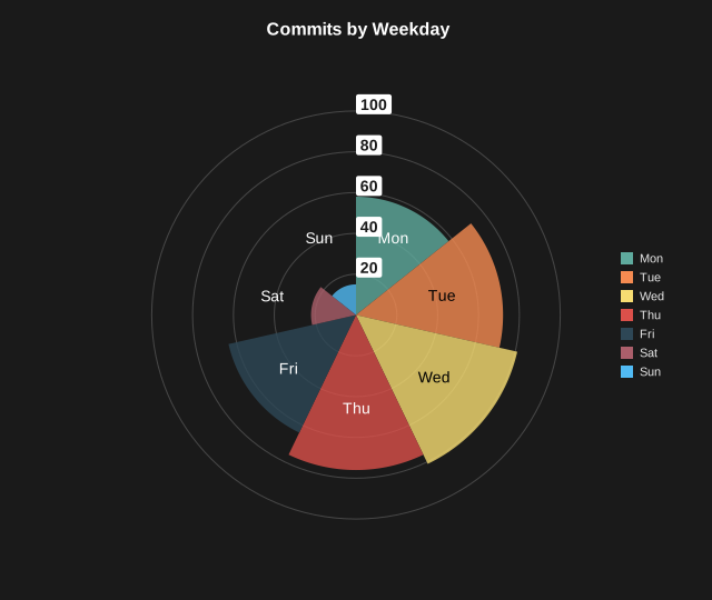 |
Sankey diagrams are also supported; see the Quick Tour for the flow and funnel examples.
Integration
Run the MCP server with no install using uvx:
uvx --from charted[mcp] charted-mcpThis fetches charted with the MCP extra into a throwaway environment and starts the server over stdio, so an agent can generate charts without you adding charted to a project or virtualenv.
Client config
| Client | Setup |
|---|---|
| Claude Code | claude mcp add charted -- uvx --from charted[mcp] charted-mcp |
| Cursor, Cline, other clients | Add the JSON below to the client's MCP server config |
{
  "mcpServers": {
    "charted": {
      "command": "uvx",
      "args": ["--from", "charted[mcp]", "charted-mcp"]
    }
  }
}The server exposes create_chart, list_chart_types, list_themes, and
chart_from_csv. See the MCP Server section
below for tool details and the pip install path.
Claude Skill
Install the chart Skill in one line:
claude skill install chartedChart gallery
The Quick Tour renders every chart type with the code that
produced it. The same examples live in docs/examples/.
Why Charted?
- Zero runtime dependencies: pure Python, no numpy/pandas required
- 15 chart types: Bar, Column, Line, Scatter, Pie, Area, Radar, Box Plot, Histogram, Heatmap, Gantt, Bubble, Combo, Polar Area, Sankey
- Multi-series support: stacked, side-by-side, grouped layouts
- Negative values handled: proper zero baseline calculations
- SVG and PNG output: SVG natively, PNG via optional
cairosvg(pip install charted[png]) - Theme system: 3 built-in presets + custom theme composition
- Per-series styling: granular control with SeriesStyle builders
- Data loading: CSV/JSON parsers built-in
- Markdown export: generate embed-ready markdown snippets
- CLI included: create charts without writing Python code
- Jupyter ready: charts render inline automatically
- Base Chart class: unified API for dynamic chart type selection
Quick Tour
Every chart type shares the same simple interface: pass data, labels, dimensions, and a title:
from charted.charts import BarChart, LineChart, PieChart

# Bar: single series with negatives
BarChart(
    title="Profit/Loss by Region ($M)",
    data=[-12, 34, -8, 52, -5, 28, 41, -19, 15, 60],
    labels=["North", "South", "East", "West", "Central", "Pacific", "Atlantic", "Mountain", "Plains", "Metro"],
    width=700, height=500,
).save("bar.svg")
# Bar: multi-series side-by-side
BarChart(
    title="Revenue vs Expenses by Quarter ($K)",
    data=[[120, -45, 180, -30, 210, -60], [-80, -20, -95, -15, -110, -25]],
    labels=["Q1 Prod", "Q1 Ops", "Q2 Prod", "Q2 Ops", "Q3 Prod", "Q3 Ops"],
    width=700, height=500,
).save("bar_multi.svg")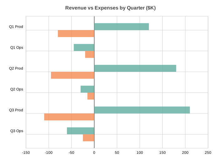
# Bar: stacked
BarChart(
    title="Budget by Department ($K)",
    data=[[100, -50, 120], [80, 60, -40]],
    labels=["Q1", "Q2", "Q3"],
    series_names=["Revenue", "Expenses"],
    x_stacked=True, width=700, height=400,
).save("bar_stacked.svg")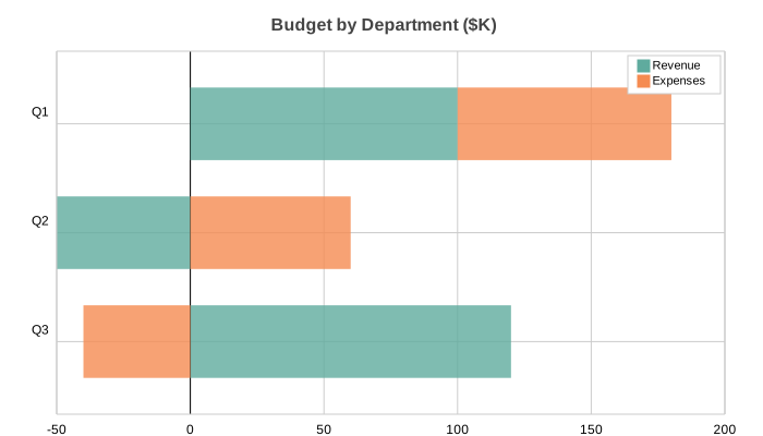
# Bar: side-by-side with negatives
BarChart(
    title="Revenue vs Expenses by Quarter ($K)",
    data=[[120, 180, 210], [-80, -95, -110]],
    labels=["Q1", "Q2", "Q3"],
    series_names=["Revenue", "Expenses"],
    width=700, height=400,
).save("bar_sidebyside.svg")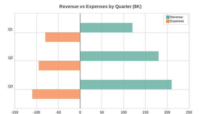
# Column: multi-series with negatives
from charted.charts import ColumnChart

ColumnChart(
    title="Year-over-Year Growth Rate (%) by Segment",
    data=[[12, -8, 22, 18, -5, 30], [-3, -15, 5, -2, -20, 8], [9, -23, 17, 16, -25, 38]],
    labels=["Q1", "Q2", "Q3", "Q4", "Q5", "Q6"],
    width=700, height=500,
    theme={"v_padding": 0.12, "h_padding": 0.10},
).save("column.svg")
# Column: stacked (default for multi-series)
ColumnChart(
    title="Year-over-Year Growth by Segment",
    data=[[12, 22, 30], [-8, -15, -20], [4, 7, 10]],
    labels=["Q1", "Q2", "Q3"],
    series_names=["Revenue", "Costs", "Net"],
    width=700, height=400,
).save("column_stacked.svg")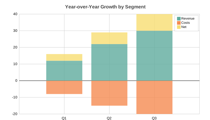
# Column: side-by-side
ColumnChart(
    title="Sales Performance by Region",
    data=[[45, 52, 38, 61], [38, 46, 52, 49], [52, 39, 46, 51]],
    labels=["Q1", "Q2", "Q3", "Q4"],
    series_names=["North", "South", "East"],
    width=700, height=400, y_stacked=False,
).save("column_sidebyside.svg")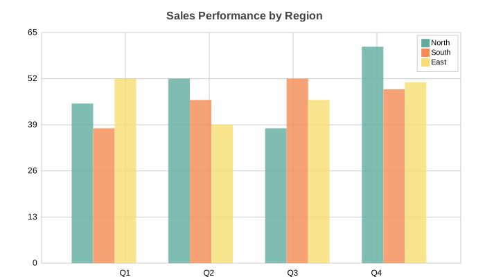
# Line: multi-series signal data
import math
from charted.charts import LineChart

n = 20
LineChart(
    title="Signal Analysis: Raw vs Filtered vs Baseline",
    data=[
        [math.sin(i * 0.5) * 30 + (i % 7 - 3) * 5 for i in range(n)],
        [math.sin(i * 0.5) * 25 for i in range(n)],
        [math.sin(i * 0.5) * 10 - 5 for i in range(n)],
    ],
    labels=[str(i) for i in range(n)],
    width=700, height=400,
).save("line.svg")
# Line: XY mode with temperature anomaly data
years = list(range(1990, 2010))
anomalies = [-15, -5, 10, 20, 5, 25, 15, 30, 10, 20, 40, 25, 45, 30, 50, 35, 60, 55, 45, 70]
baseline = [round(5 + 2 * math.sin(i * 0.4) + i * 0.5, 1) for i in range(len(years))]

LineChart(
    title="Temperature Anomaly vs 5-Year Rolling Baseline (1990-2009)",
    data=[anomalies, baseline],
    x_data=years,
    labels=[str(y) for y in years],
    width=700, height=400,
).save("xy_line.svg")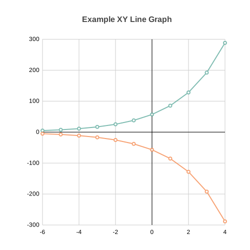
# Line: single series
LineChart(
    title="Monthly Active Users (K)",
    data=[[42, 48, 55, 61, 58, 70, 80, 78, 85, 92, 88, 100]],
    labels=["Jan", "Feb", "Mar", "Apr", "May", "Jun", "Jul", "Aug", "Sep", "Oct", "Nov", "Dec"],
    series_names=["MAU"], width=700, height=400,
).save("line_single.svg")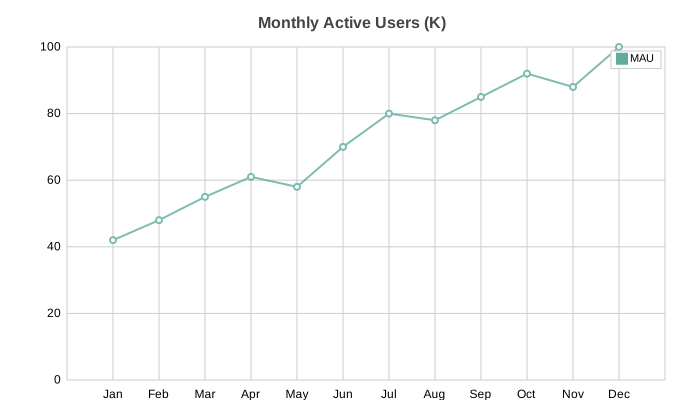
# Line: log scale (opt-in) for data spanning orders of magnitude.
# Pass y_scale="log" (or x_scale="log"); a LogScale instance also works.
LineChart(
    title="Requests/sec (log scale)",
    data=[[1, 8, 60, 450, 3200, 25000]],
    labels=["t0", "t1", "t2", "t3", "t4", "t5"],
    series_names=["rps"],
    y_scale="log",
    width=700, height=400,
).save("line_log.svg")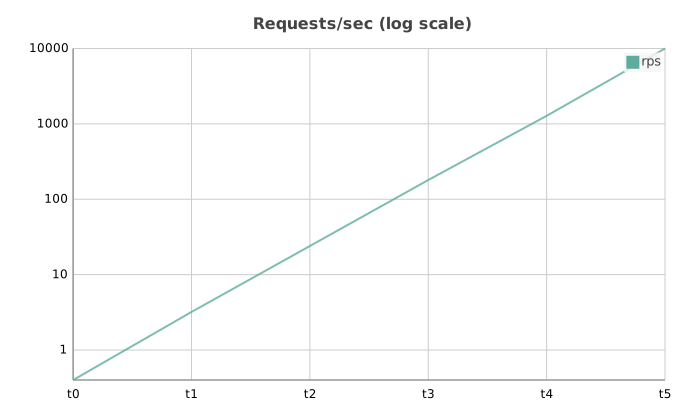
# Scatter: multi-series cluster analysis
import random
from charted.charts import ScatterChart

random.seed(42)
ca_x = [30 + random.gauss(0, 8) for _ in range(20)]
ca_y = [40 + random.gauss(0, 8) for _ in range(20)]
cb_x = [70 + random.gauss(0, 10) for _ in range(20)]
cb_y = [20 + random.gauss(0, 10) for _ in range(20)]

ScatterChart(
    title="Cluster Analysis: Two Distinct Populations",
    x_data=[ca_x, cb_x], y_data=[ca_y, cb_y],
    series_names=["Cluster A", "Cluster B"],
    width=700, height=400,
).save("scatter.svg")
# Scatter: single series with quadratic curve
random.seed(1)
x_vals = [i for i in range(5, 95, 5)]
y_vals = [round(10 + (v - 50) ** 2 / 50 + random.gauss(0, 4), 1) for v in x_vals]

ScatterChart(
    title="U-Shaped Response Curve: Signal vs Input",
    x_data=x_vals, y_data=y_vals,
    series_names=["Observations"],
    width=700, height=400,
).save("scatter_single.svg")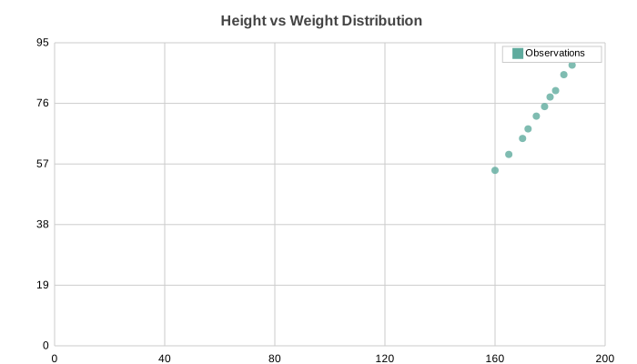
# Pie: basic
from charted.charts import PieChart

PieChart(
    title="Market Share by Product Line",
    data=[35, 28, 18, 12, 7],
    labels=["Product A", "Product B", "Product C", "Product D", "Other"],
    width=600, height=500,
).save("pie.svg")
# Pie: doughnut mode
PieChart(
    title="Operating System Market Share",
    data=[72, 15, 8, 5],
    labels=["Windows", "macOS", "Linux", "Other"],
    inner_radius=0.5, width=600, height=500,
).save("pie_doughnut.svg")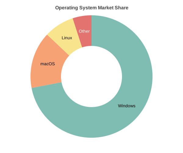
# Radar: multi-series
from charted.charts import RadarChart

RadarChart(
    title="Player Skill Comparison",


…